Code

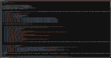
The source code, while hard to see above, is loaded with quite a lot of information. There's a lot of JavaScript utilized in the code, something I am not very familiar with. For the most part, however, It's quite familiar HTML code, with lots of nonbreaking spaces used in quite a few spots. There's also some SVG images used, something I have some experience with but haven't used much in action. Overall, aside from the JS use, it's a pretty standard build through HTML; paragaphs, lists, spans, and defined classes and IDs.
User Interface - UI

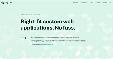
The UI is quite amusing to look at. It's a pretty standard home page with a nav at the top, and information set front and center when you enter the page. The background has a bunch of boxes that move around with the cursor, and scrolling down will collapse the boxes, and scrolling up will expand them to their previous form. It's a simple but effective UI that gives the user an appealing look and a simple navigation.
User Experience - UX

The UX on the website is quite enjoyable for what it is. In the picture above is the nav menu, which has it clearly labeled which of the nav items is currently active, in case the user can't rememeber which one they were on. The pages are also really streamlined; its a straight scroll with information being given one piece at a time instead of multiple columns of info. It's not much, but it allows for a simple visit to the website with everything labeled as it should be and not complicated like some websites tend to do.
Summary
The website is made to provide custom software to businesses that require more specific software for their needs that either isn't accessible or not user friendly for their needs. The website gets the job done; the user can navigate super efficiently and have an appealing image throughout their search. If this website had some super basic UI with a painfully confusing or furstrating UX, then I don't think this website would get very much traffic or commerce. On a scale of 1-10, I'd rate it a 9.